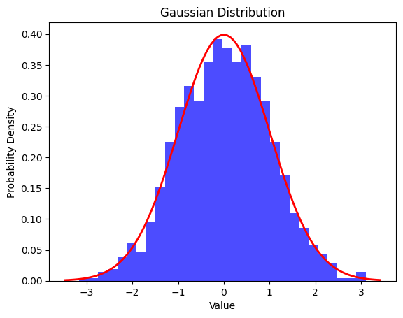
The probability density function (PDF) of a Gaussian distribution is given by the formula:
where:
- ( f(x) ) is the probability density function,
- ( x ) is the random variable,
- ( μ ) is the mean (average) of the distribution,
- ( σ ) is the standard deviation, and
- ( e ) is the base of the natural logarithm.
Key properties of a Gaussian distribution include:
- Symmetry: The distribution is symmetric around its mean, with approximately 68.26% of the data falling within one standard deviation (<σ) of the mean (μ), 95.44% within two standard deviations (2σ), and 99.72% within three standard deviations (<3σ). The rest, 0.28% of the whole data, lies outside three standard deviations (>3σ) of the mean (μ), and this part of the data is considered as outliers.
- Bell-shaped curve: The probability density is highest at the mean and decreases as values move away from the mean in both directions.
- Central Limit Theorem: The sum (or average) of a large number of independent and identically distributed random variables, regardless of their original distribution, tends to follow a Gaussian distribution.
Gaussian distributions are widely used in various fields, including statistics, physics, finance, and machine learning, due to their mathematical properties and applicability to real-world phenomena.
You can draw a Gaussian distribution in Python using libraries such as numpy and matplotlib. Here’s a simple example:
import numpy as np
import matplotlib.pyplot as plt

# Generate data points for a Gaussian distribution
mean = 0  # Mean of the distribution
std_dev = 1  # Standard deviation of the distribution
num_points = 1000  # Number of data points

data = np.random.normal(mean, std_dev, num_points)

# Plot the histogram of the data
plt.hist(data, bins=30, density=True)

# Plot the probability density function (PDF) of the Gaussian distribution
xmin, xmax = plt.xlim()
x = np.linspace(xmin, xmax, 100)
pdf = (1/(std_dev * np.sqrt(2 * np.pi))) * np.exp(-(x - mean)**2 / (2 * std_dev**2))
plt.plot(x, pdf, color='red')

# Add labels and title
plt.xlabel('Value')
plt.ylabel('Probability Density')
plt.title('Gaussian Distribution')

# Show the plot
plt.show()
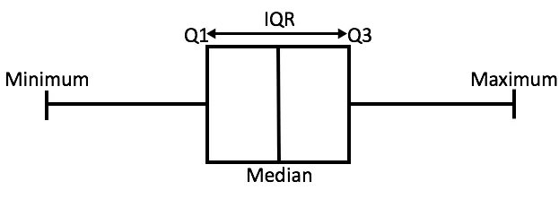
Let’s review the Box Plot of the Gaussian Distribution

In the above figure,
- Minimum is the minimum value in the dataset,
- Maximum is the maximum value in the dataset.
So the difference between the two tells us about the range of dataset.
- The Median is the median (or center point), also called second quartile of the data.
- Q1 is the first quartile of the data, i.e., to say 25% of the data lies between minimum and Q1.
- Q3 is the third quartile of the data, i.e., to say 75% of the data lies between minimum and Q3.
The difference between Q3 and Q1 is called the Inter-Quartile Range or IQR.
IQR = Q3 - Q1Any data point less than the Lower Bound or more than the Upper Bound is considered as an outlier.
- Lower Bound = Q1 – 1.5 * IQR
- Upper Bound = Q3 + 1.5 * IQR

