Key features of Seaborn include:
- Statistical Plots: Seaborn simplifies the process of creating statistical plots by providing several high-level functions for common statistical visualizations. These include scatter plots, line plots, bar plots, box plots, violin plots, heatmaps, and more.
- Integration with Pandas: Seaborn works seamlessly with Pandas DataFrames, making it easy to use data stored in Pandas for visualization.
- Color Palettes: Seaborn provides a variety of color palettes that enhance the aesthetics of plots. It allows users to easily customize the color schemes to fit the visual needs of their data.
- Automatic Estimation and Aggregation: Seaborn often performs automatic estimation and aggregation of data, simplifying the process of creating complex visualizations.
To use a library in your Python code, you typically need to install it first using a package manager like pip. Once installed, you can import and use the library’s functions and modules in your programs:
import matplotlib.pyplot as plt
import seaborn as sns

%matplotlib inline
Set
In Seaborn (often abbreviated as sns), sns.set() is a function used to set the aesthetic parameters of the Seaborn library. It is commonly used to customize the visual appearance of plots created with Seaborn.
sns.set() without any arguments will reset the parameters to the default settings. You can also pass various parameters to sns.set() to customize the appearance of your plots, such as the style, color palette, font scale, and more.
For example:
import seaborn as sns

#resets the parameters to the default
sns.set()

# Set the style to whitegrid
sns.set(style="whitegrid")

# Set the color palette to a specific set of colors
sns.set_palette("pastel")

# Adjust the font scale
sns.set(font_scale=1.2)
Histogram
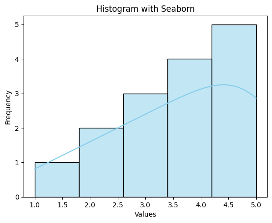
In Seaborn, you can create histograms using the sns.histplot() function. A histogram is a graphical representation of the distribution of a dataset. It displays the frequency or count of data points within specified intervals or “bins.”
Here’s a simple example of creating a histogram with Seaborn:
import seaborn as sns
import matplotlib.pyplot as plt

# Sample data
data = [1, 2, 2, 3, 3, 3, 4, 4, 4, 4, 5, 5, 5, 5, 5]

# Create a histogram using Seaborn
sns.histplot(data, bins=5, kde=False, color='skyblue')

#either use plt.show() or add ; add the end of command, like below:
#sns.histplot(data, bins=5, kde=True, color='skyblue');

# Add labels and title
plt.xlabel('Values')
plt.ylabel('Frequency')
plt.title('Histogram with Seaborn')

# Show the plot
plt.show()
Tips:
- Kernel Density Estimate (KDE) provides a smooth, curve-like representation of the data distribution, which can be helpful for visualizing the shape and characteristics of the data. It is commonly used in statistics, data visualization, and machine learning.
- If we want to specify the width of the intervals (or groups or bins), we can use binwidth parameter.
- We can specify the number of intervals (or groups or bins) to create by setting the bins parameter.
How to find the optimal number of bins: Rule of thumb
We calculate the bin-width first, using the following formula:
where n = number of rows the dataset
Then, we obtain bins using the calculated bin-width:
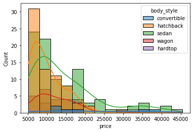
When we want to compare the distributions of several groups, for example, price of cars for different body styles, we can use subplots with FacetGrid:
#in same plot
sns.histplot(data=df, x='price', hue='body_style', kde=True);
#subplots:
g = sns.FacetGrid(df, col='body_style')
g.map(sns.histplot, 'price')
plt.show()

Box Plot
A boxplot (box-and-whisker plot) is a statistical visualization that provides a summary of the distribution of a dataset. It displays key summary statistics, including the median, quartiles, and potential outliers. In Seaborn, you can create a boxplot using the sns.boxplot() function.
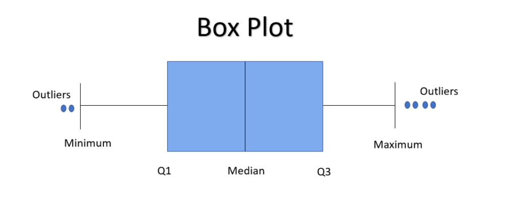
Here’s a brief explanation of the components of a boxplot:
- Box (Interquartile Range): The box represents the interquartile range (IQR), which is the range between the first quartile (Q1) and the third quartile (Q3). The height of the box indicates the spread of the middle 50% of the data.
- Line Inside the Box (Median): The line inside the box represents the median, which is the middle value of the dataset when it is sorted.
- Whiskers: The whiskers extend from the box to the minimum and maximum values within a certain distance from the quartiles. They give an idea of the range of the data.
- Outliers: Points beyond the whiskers are considered potential outliers and are often shown individually.
Here’s an example of creating a boxplot using Seaborn:
import pandas as pd
import seaborn as sns
import matplotlib.pyplot as plt

# Sample data
data = {'Category': ['A', 'B', 'A', 'C', 'B', 'B', 'A', 'C', 'A', 'B', 'C'],
        'Value': [10, 15, 20, 25, 30, 35, 40, 45, 50, 55, 60]}

df = pd.DataFrame(data)

# Create a boxplot using Seaborn
#sns.boxplot(x='Category', y='Value', data=df, palette='pastel')
sns.boxplot(x='Category', y='Value', hue='Category', data=df, palette='pastel')

# Add labels and title
plt.xlabel('Category')
plt.ylabel('Value')
plt.title('Boxplot with Seaborn')

# Show the plot
plt.show()
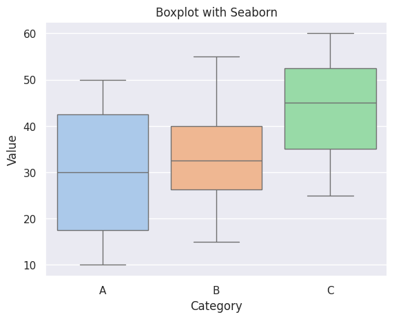
In a boxplot, when the median is closer to the left of the box and the whisker is shorter on the left end of the box, we say that the distribution is positively skewed (right skewed).

Similarly, when the median is closer to the right of the box and the whisker is shorter on the right end of the box, we say that the distribution is negatively skewed (left skewed).

Bar Plot (Count Plot)
A bar graph represents the relationship between a categorical variable and a numerical variable. It is particularly useful for comparing the values of different categories. In Seaborn, a bar graph can be created using the sns.barplot() function.
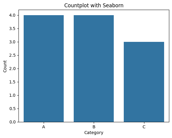
Additionally, Seaborn provides other functions like countplot() for counting the occurrences of each category. It is particularly useful for visualizing the distribution of categorical data and understanding the frequency of each category.
Seaborn also provides pointplot() for showing point estimates and confidence intervals.
Here’s a simple countplot example:
import pandas as pd
import seaborn as sns
import matplotlib.pyplot as plt

# Sample data
data = {'Category': ['A', 'B', 'A', 'C', 'B', 'B', 'A', 'C', 'A', 'B', 'C']}

df = pd.DataFrame(data)

# Create a countplot using Seaborn
sns.countplot(data=df, x='Category')

# Add labels and title
plt.xlabel('Category')
plt.ylabel('Count')
plt.title('Countplot with Seaborn')

# Show the plot
plt.show()
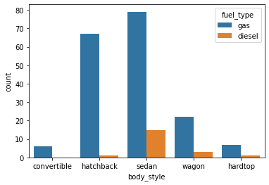
We can also make the plot more granular by specifying the hue parameter to display counts for subgroups.
sns.countplot(data=df, x='body_style', hue='fuel_type');
Tips:
In the context of Matplotlib (a popular plotting library in Python), a figure is a container that holds all the elements of a plot. It can contain one or more axes (subplots), titles, labels, and other elements. When you create a plot using Matplotlib, you generally start by creating a figure, then adding one or more axes to the figure, and finally, plotting your data on those axes.
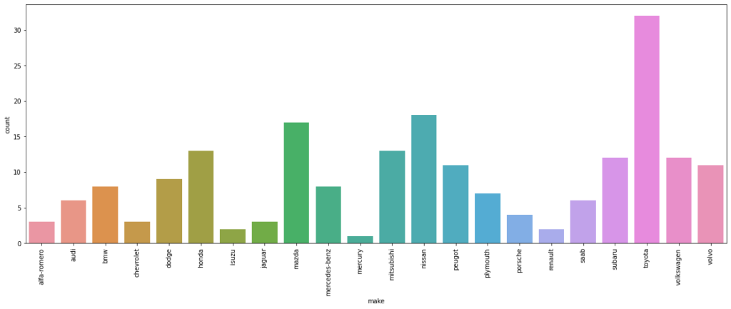
plt.figure(figsize=(20,7))
sns.countplot(data=df, x='make')
plt.xticks(rotation=90)
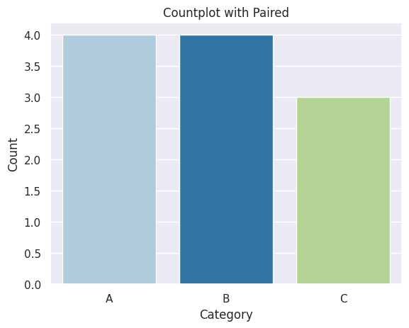
When you use palette="paired", you are specifying a predefined qualitative color palette named “Paired.” The “Paired” palette is designed for visualizing paired categorical data, and it provides distinct colors for different categories.
# Sample data
data = {'Category': ['A', 'B', 'A', 'C', 'B', 'B', 'A', 'C', 'A', 'B', 'C']}

df = pd.DataFrame(data)

# Create a countplot using Seaborn
sns.countplot(data=df, x='Category', palette='Paired')

# Add labels and title
plt.xlabel('Category')
plt.ylabel('Count')
plt.title('Countplot with Paired')

# Show the plot
plt.show()
Line Plot
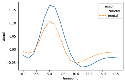
A line plot is used to visualize the relationship between two continuous variables over a continuous or ordered variable (usually time).
In Seaborn, a line plot can be created using the sns.lineplot() function. You can customize line plots further by adjusting parameters such as hue, style, and ci (confidence intervals).
Here’s a simple example:
# loading one of the example datasets available in seaborn
fmri = sns.load_dataset("fmri")

# creating the line plot
sns.lineplot(data = fmri, x="timepoint", y="signal", hue="region", style="region", ci = False);
Scatter Plot
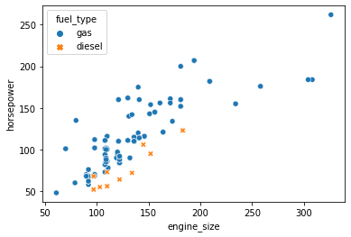
A scatter plot is a type of data visualization that displays individual data points on a two-dimensional plane. Each data point is represented by a marker (such as a dot or other symbol), and the position of the marker on the x and y axes corresponds to the values of two variables. Scatter plots are useful for visualizing the relationship or correlation between two continuous variables.
Here is a simple example:
import pandas as pd
import seaborn as sns
import matplotlib.pyplot as plt

# Sample data
data = {'X': [1, 2, 3, 4, 5],
        'Y': [10, 15, 12, 18, 20]}

df = pd.DataFrame(data)

# Create a scatter plot using Seaborn
sns.scatterplot(x='X', y='Y', data=df, color='skyblue', marker='o')

# Add labels and title
plt.xlabel('X')
plt.ylabel('Y')
plt.title('Scatter Plot with Seaborn')

# Show the plot
plt.show()

#We can also check the relationship between two variables for different categories by specifying
#the hue parameter and we can assign hue to another parameter called style, which will vary
#the markers and create a more readable plot
sns.scatterplot(data=df, x='engine_size', y='horsepower', hue='fuel_type', style='fuel_type');
Correlation
Correlation means association. More precisely, it expresses the extent to which two variables change together at a constant rate.
- In a scatter plot when the y variable tends to increase as the x variable increases, we say there is a positive correlation between the variables.
- Again, when the y variable tends to decrease as the x variable increases, we say there is a negative correlation between the variables.
- If the points on the scatter plot seem to be scattered randomly, we say that there is no correlation between the variables.
Linear Model Plot
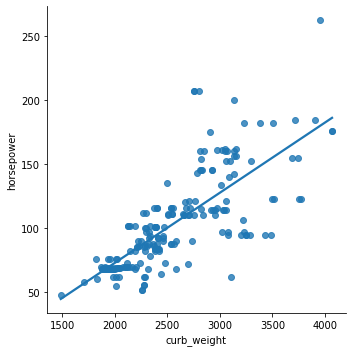
The lmplot function in Seaborn is used for creating a scatter plot with the added functionality of fitting and displaying a linear regression model. It is especially useful when you want to explore the relationship between two variables and visualize how well a linear regression line fits the data.
Here’s a basic example of using sns.lmplot:
sns.lmplot(data=df, x='curb_weight', y='horsepower', ci=False);
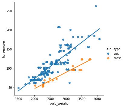
We can also check the relationship between two variables for different categories (a third variable) by specifying the hue parameter.
sns.lmplot(data=df, x='curb_weight', y='horsepower', hue='fuel_type',ci=False);
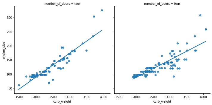
We can also plot the levels of the third variable across different plots
sns.lmplot(data=df, x='curb_weight', y='engine_size', col='number_of_doors', ci=False)
Joint Plot
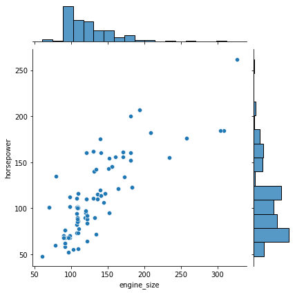
jointplot is a function in Seaborn that allows you to create a multi-panel figure that shows the joint distribution of two variables along with their individual univariate distributions. This can be particularly useful for exploring the relationship between two numerical variables.
It comprises three plots – one displays the relationship between two variables while the other two show the individual distribution of each variable in the margins.
Here’s an example of using sns.jointplot:
sns.jointplot(data=df, x='engine_size', y='horsepower');
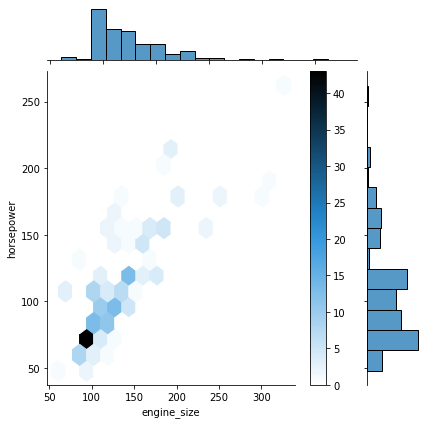
One of the drawbacks of scatterplots is the overlapping of points. When we have large volumes of data to plot, the data points in the plot overlap with each other, making it difficult to interpret the data.
In such cases, we can divide the entire plot into bins using different shapes (square, triangle, hexagon, etc.) and then try to see the number of data points falling within each of the bins.
seaborn’s jointplot() provides a 'hex' kind to plot the data in above-mentioned way.
sns.jointplot(data=df, x='engine_size', y='horsepower', kind="hex");
plt.colorbar(); # adds a separate axis indicating the color scale in this plot
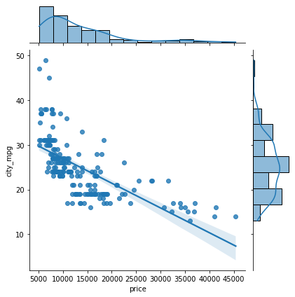
By using kind = "reg", we can use the joint point to find the best line or curve that fits the plot.
sns.jointplot(data=df, x='price', y='city_mpg', kind="reg");
Violin Plot
A violin plot is a data visualization that combines aspects of a box plot and a kernel density plot. It is used to display the distribution of a quantitative variable across different levels of a categorical variable. Violin plots provide insights into both the summary statistics (like a box plot) and the underlying distribution of the data.
Key features of a violin plot:
- Box Plot: Similar to a box plot, a violin plot includes a box-and-whisker diagram that shows the median, quartiles, and potential outliers.
- Kernel Density Estimation (KDE): In addition to the box plot, a violin plot includes a kernel density estimate, which provides a smoothed representation of the distribution of the data.
- Width of the Violin: The width of the violin at a specific point represents the density of the data at that value. Wider parts of the violin indicate higher density.
Here’s an example of creating a violin plot using Seaborn:
sns.violinplot(data=df, x='fuel_type', y='horsepower', orient='v');
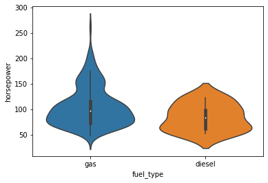
We can use the palette parameter to change the color.
Strip Plot
A strip plot is a type of categorical scatter plot used in data visualization to display individual data points along a single axis. It is especially useful when you have a relatively small dataset and want to show the distribution of values within different categories.
In a strip plot, each data point is represented as a dot or marker along the categorical axis, and the dots are stacked to avoid overlap. This allows you to see the distribution of data points and potential patterns within each category.
sns.stripplot(data=df, x='engine_size');
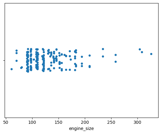
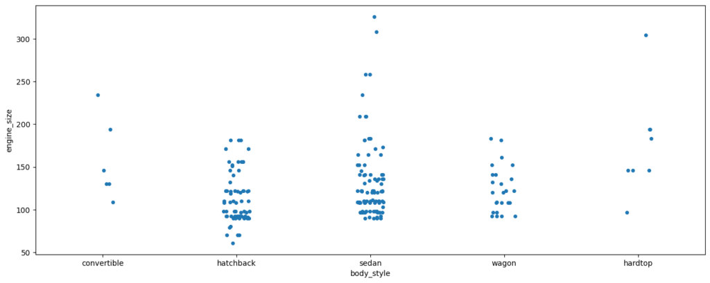
Strip plots are more useful when we add random noise called jitter to avoid overlapping of data points with same values.
plt.figure(figsize=(16,6))
sns.stripplot(data=df, x='body_style', y='engine_size', jitter=True);
Swarm Plot
A swarm plot is a categorical scatter plot similar to a strip plot, but it goes a step further to prevent points from overlapping. It positions individual data points in such a way that they do not overlap with each other, providing a clearer visualization of the distribution of data within different categories.
In a swarm plot, data points are evenly distributed along the categorical axis, avoiding overlap while still maintaining the ability to see the individual points. This can be useful when you have a relatively small dataset and want to show the distribution of values within different categories.
Here’s an example of creating a swarm plot using Seaborn:
sns.swarmplot(data=df, x="number_of_doors", y="price");
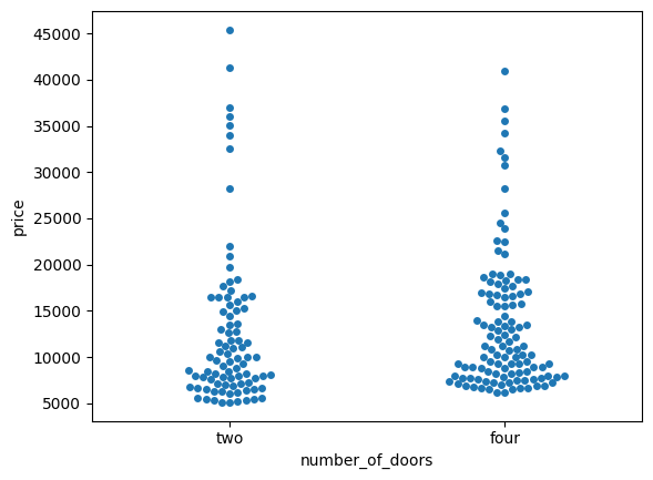
We can add the hue parameter to swarmplot() and separate the categories.
sns.swarmplot(data=df, x="fuel_type", y="price", hue="number_of_doors");
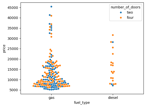
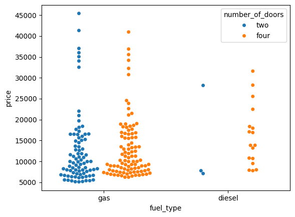
We can split the two products setting the dodge argument to True.
sns.swarmplot(data=df, x="fuel_type", y="price", hue="number_of_doors", dodge=True);
Catplot
catplot is a versatile function in Seaborn that can be used to create various types of categorical plots. It is a figure-level function, which means it creates a new figure and returns a Seaborn FacetGrid object that allows you to create multiple plots in a grid arrangement.
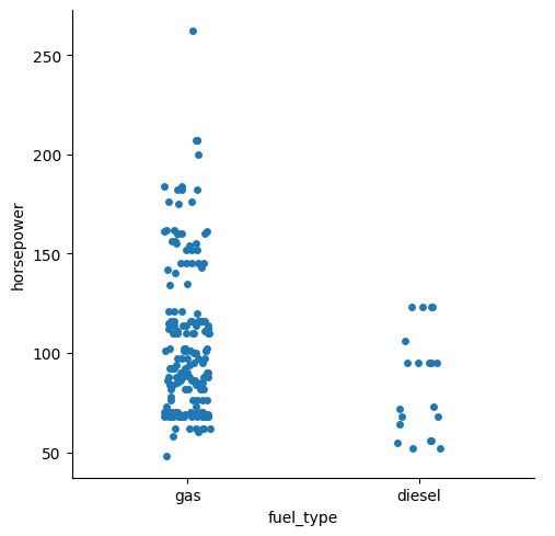
With catplot, you can create different types of categorical plots by specifying the kind parameter. Available options are ‘strip‘, ‘swarm‘, ‘box‘, ‘boxen‘, ‘violin‘, ‘bar‘, ‘count‘, and ‘point‘. The default kind is ‘strip’.
sns.catplot(data=df, x="fuel_type", y="horsepower");
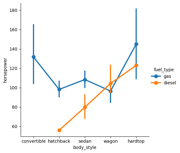
We can set kind='point' to create a pointplot using the catplot() function. A pointplot helps us to see how the main relationship is changing as a function of the second variable.
sns.catplot(data=df, x="body_style", y="horsepower", hue="fuel_type", kind="point");
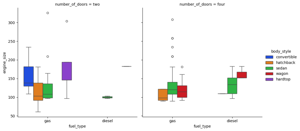
Catplot is very useful to draw categorical plots onto a FacetGrid by assigning a third variable to the col parameter.
sns.catplot(data=df, x="fuel_type", y="horsepower", hue="number_of_doors", col="drive_wheels", kind="bar", palette="pastel");

Let’s check out the catplot() function for a few more attributes in the data:
sns.catplot(data=df, x="fuel_type", y="engine_size", hue="body_style", col="number_of_doors", kind="box", palette="bright");
sns.catplot(data=df, x="number_of_doors", y="price", hue="body_style", col="fuel_type", kind='swarm', palette='muted');
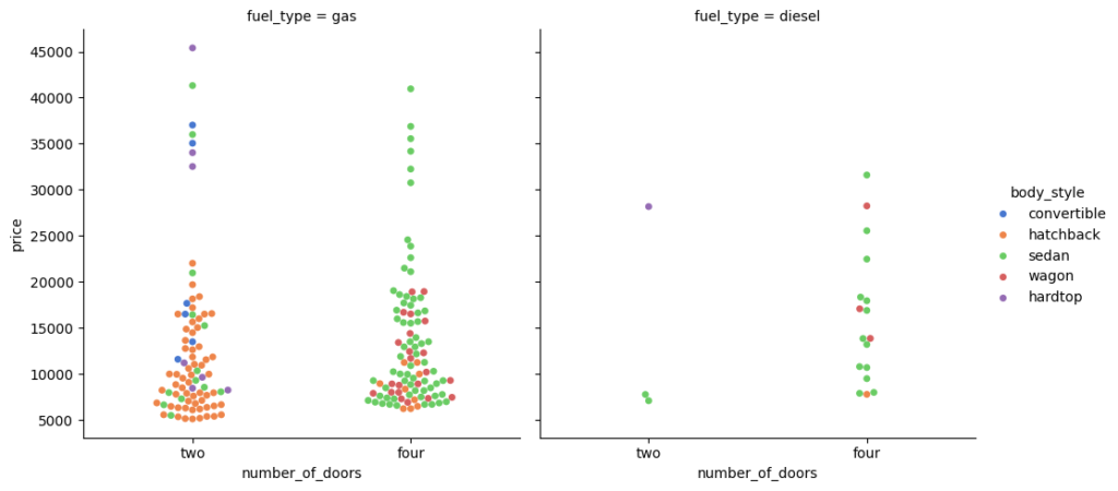
You can use height and aspect to adjust the size of graph.
Pair Plot
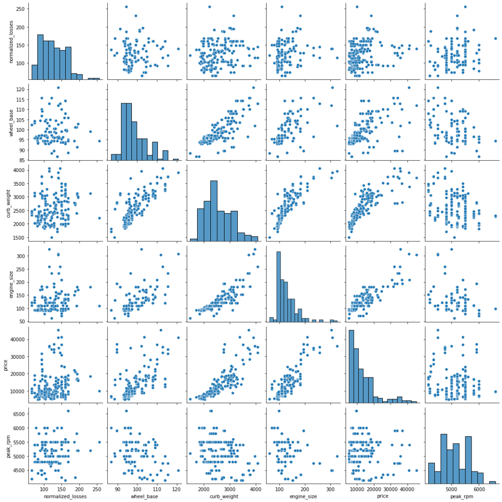
pairplot is a Seaborn function that creates a matrix of scatterplots for visualizing pairwise relationships between numerical variables in a dataset. It provides a quick and convenient way to explore the correlation and distribution of data across multiple dimensions.
It creates a matrix of scatterplots to visualize the relationships between pairs of numerical variables. Each cell in the matrix represents the scatterplot between two numerical variables, and the diagonal cells often contain histograms of the individual variables.
Pairplots are effective for exploring the correlation and distribution of numerical data across multiple dimensions. They provide insights into the relationships between variables, identify potential patterns, and help in initial data exploration.
Here is an example of seaborn’s pairplot:
sns.pairplot(data=df[['normalized_losses','wheel_base','curb_weight','engine_size','price','peak_rpm']])
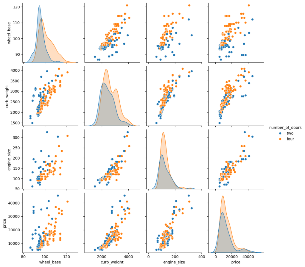
We can add the hue parameter in pairplot to create a semantic mapping. It changes the default marginal plot to a layered kde plot.
Also, we can add vars parameter to assign a list of variables from the dataset for which we want to create the pairplot.
sns.pairplot(data=df, vars=['wheel_base', 'curb_weight', 'engine_size', 'price'], hue='number_of_doors');
We can set corner=True to plot only the lower triangle of a pairplot.
Heatmap
Heatmap is particularly useful for representing numerical data in the form of a matrix, where each cell’s color represents the value of the corresponding data point. Heatmaps are excellent for visualizing patterns and structures in the data. They can reveal trends, clusters, or correlations in a dataset. In a correlation matrix, each cell represents the correlation coefficient between two variables. A heatmap helps quickly identify strong and weak correlations.
Here’s a simple example of creating a heatmap using Seaborn:
sns.heatmap(data=df[['wheel_base','curb_weight','engine_size','price']].corr());
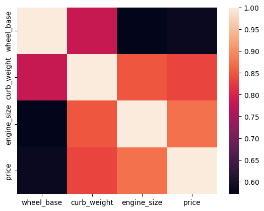
We can set the annot parameter to True for displaying the numeric value in each cell. To remove the color bar, the cbar parameter can be set to False.
sns.heatmap(data=df[['wheel_base','curb_weight','engine_size','price']].corr(), annot=True, cbar=False);
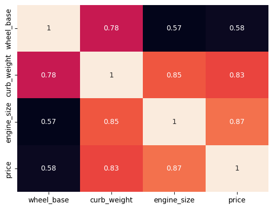
We can apply a different colormap with the cmap parameter for better visual appeal.
sns.heatmap(data=df[['wheel_base','curb_weight','engine_size','price']].corr(), annot=True, cmap='YlGnBu');
Point Plot
In Seaborn, a pointplot is a categorical plot that displays the estimate of central tendency (usually the mean) along with the variability for different levels of a categorical variable. It is essentially a combination of a bar plot and a line plot.
The pointplot shows point estimates and confidence intervals, making it useful for visualizing the relationship between two categorical variables. It is particularly effective for comparing multiple categories and identifying patterns or trends.
Here is a basic example of how to use seaborn.pointplot:
import seaborn as sns
import matplotlib.pyplot as plt

# Sample data
tips = sns.load_dataset('tips')

# Create a pointplot
sns.pointplot(x='day', y='total_bill', data=tips, ci='sd', capsize=0.2)

# Show the plot
plt.show()
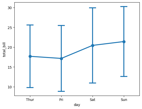
In this example:
x='day'specifies the categorical variable on the x-axis.y='total_bill'specifies the numerical variable on the y-axis.data=tipsis the DataFrame containing the data.ci='sd'sets the confidence interval to represent the standard deviation.capsize=0.2determines the size of the caps on the error bars.
The resulting plot will show points representing the mean total bill for each day, and error bars extending from the mean to the confidence interval. This allows you to visualize both the central tendency and variability in the data for different categories.
Adjust the parameters according to your specific needs, and explore the seaborn.pointplot documentation for more customization options: Seaborn Pointplot Documentation.

