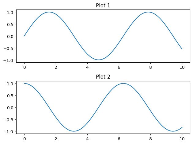
You can use the subplot function in Matplotlib to create multiple plots arranged in a grid. To put two plots on top of each other, you can use the following approach:
import matplotlib.pyplot as plt
import numpy as np

# Create data for the plots
x = np.linspace(0, 10, 100)
y1 = np.sin(x)
y2 = np.cos(x)

# Create a subplot with 2 rows and 1 column
# The first plot will go in the first row, and the second plot in the second row
plt.subplot(2, 1, 1)
plt.plot(x, y1, label='Sin(x)')
plt.title('Plot 1')

plt.subplot(2, 1, 2)
plt.plot(x, y2, label='Cos(x)')
plt.title('Plot 2')

# Adjust layout for better spacing
plt.tight_layout()

# Show the plots
plt.show()
In this example, plt.subplot(2, 1, 1) creates the first subplot in a 2-row, 1-column grid, and plt.subplot(2, 1, 2) creates the second subplot beneath the first one. You can adjust the number of rows and columns based on your layout requirements.
The tight_layout() function is used to automatically adjust the subplot parameters for better spacing. Adjust the title and other plot settings as needed for your specific use case.
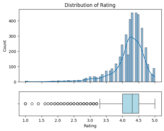
Since histograms and boxplots are commonly used together, we can create a function that combines them for us:
def hist_and_boxplot(df, label):
  plt.subplots(2, 1, sharex=True, gridspec_kw={'height_ratios': [3,1]})

  plt.subplot(2, 1, 1)
  plt.title(f'Distribution of {label}')
  sns.histplot(data=df, x=label, kde=True)

  plt.subplot(2, 1, 2)
  sns.boxplot(data=df, x=label, vert=False, boxprops=dict(facecolor='lightblue'))

  plt.show()

hist_and_boxplot(df, 'Rating')